TRAFx Insights
Are you interested in taking your counting project to the next level? Use TRAFx Insights to help you get there.
Using big data to understand trail use: Strava
Version July 27, 2023, Jacob Herrero (MEDes.), TRAFx Research
In this updated article I introduce two Strava Inc. software tools relevant to those who plan, manage or advocate for trails and trail systems. Strava Global Heatmap is free to all, and Strava Metro is free to qualified organizations. First, I explore the opportunities and limitations associated with Global Heatmap, using trails in Canmore, Canada, as an example, while recognizing its primary purpose is to help people find popular cycling, running and other routes. I then introduce Strava Metro, a tool that explicitly targets the planning needs of government organizations.
I wrote the first version of this article in 2016, soon after Strava Global Heatmap and Strava Metro were released. This updated 2023 version includes some key insights researchers and others have gained since then about Strava data. Particularly, over the intervening years, researchers and practitioners have more thoroughly identified limitations and biases associated with Strava data when used for planning in the public domain. Further, despite Strava providing a good “no GIS…no technical experience required” user interface for Strava Metro, it is increasingly clear that a solid understanding of data science — and indeed social science — is required to avoid misleading conclusions. Overall, Strava data should be used with greater care and caution than originally thought, despite the total number of Strava GPS data points increasing from 1 trillion to 13 trillion globally since 2016. Strava data has become impressively “big” — the true definition of big data — but not necessarily better for planning purposes.
In this article the term “trail” is interchangeable with path, route or track.
Summary
- Big data—billions of data points—for trail planning, management and advocacy purposes sounds both futuristic and unattainable. In reality it has been a potential option for over a decade through data tools that utilize crowdsourced GPS tracks.
- Such data tools show how certain individuals use trails and trail networks and are particularly useful over larger areas. However, alone, without other supporting data sources (e.g., counters, surveys), such tools have various weaknesses including, for example, bias problems (e.g., walkers, women, youth, and older people are often unrepresented).
- Strava currently dominates the crowdsourced GPS tracks domain. It is a software service (website and app) used by people who bike, run, etc. to track themselves, using GPS-enabled devices (e.g., iPhones, Android phones, GPS watches, Garmin, etc.), for fitness, training, social and other purposes. Strava Inc. currently (2023) claims to have a database of over 13 trillion data points globally.
- Strava Global Heatmap is a free cartographic data tool, available to all, that utilizes Strava’s GPS data points to show trails popular among Strava users. Planning-related use cases include identifying:
- regional trail-based recreation networks and hotspots.
- trails with potential for inter-user conflict (e.g., cyclists vs non-cyclists); and
- potential locations to install trail counters and / or to conduct surveys.
- Strava Metro, which primarily targets government organizations, provides aggregated, 'de-personalized' Strava user data for a particular area, including activity type (bike, run, etc.), direction of travel, user volume, gender, age, speed, duration, and routing. Strava Metro data is generally a good match for larger networks of higher use:
- Bicycle-oriented routes, paths, trails, etc.
- Multi-use paths and trails used by people who ride and run
- Mountain bike trails
- Strava Metro data is more reliable when applied over larger regions and over longer periods of time (i.e., months rather than hours and days), and when examining relative changes.
- Strava Metro data has important limitations including: (1) walkers and hikers are underrepresented (small sample size weakness); (2) demographic bias (women, youth and older people are unrepresented); (3) a good understanding of data science is required; (4) improper use of simple statistical correlations can lead to misleading conclusions; (5) rounding error inaccuracies for lower use trails and hours; (6) inappropriate for very low use trails (Strava’s algorithm generally disregards these); and, (7) it needs to be calibrated with conventional “small data” techniques such as counters and surveys.
- To date, Strava GPS data, a type of big data, has mainly been used in urban areas and much less in rural areas.
- In the context of bicycling, Strava use often varies from approximately 1 to 20% of total use. Therefore, for accuracy, and to gain the confidence of the public and decision makers, it is necessary to calibrate Strava data with trail traffic counters and/or surveys at a sufficient number of locations. This quote from a comprehensive 2022 study sums it up nicely:
“One thing that the process made clear is that rather than replacing conventional bike data sources and count programs, big data sources like Strava and StreetLight actually make the old “small” data even more important.”
- Simple, lower cost volumetric trail counters in combination with Strava Metro data, and survey data, create the potential to provide richer and more complete data (use type, direction of travel, speed, routing, etc.), over a wider area and for a lower cost than traditional methods.
- It is unlikely that any one source of data will replace all others. Instead, the different sources (crowdsourced GPS-based, trail counter, survey, etc.) have the potential to complement and strengthen each other.
Summary table - Strava Global Heatmap vs Strava Metro
|
Strava product |
Identifying regional hotspots |
Identifying trail networks |
Choosing trails to count |
Trail use type
|
Counts |
Direction of travel |
Speed |
Origin, destination, route |
|
|
|
|
|
|
|
|
|
|
|
|
|
|
|
|
|
|
|


Contents
Strava Metro and trail counter data
Appendix 1 - Suggested reading
Crowdsourcing Bicycle Volumes (2014)
Exploring Data Fusion Techniques to Estimate Network-Wide Bicycle Volumes (2022)
Bias and precision of crowdsourced recreational activity data from Strava (2023)
Screenshots of the Strava app; Image source: Strava

“Big data makes very little sense without small data to benchmark against”
@abudhabichris, cyclist
Objective
Big data—billions of data points—for trail planning, management and advocacy purposes sounds both futuristic and unattainable. In reality it has been a potential option for over a decade through data tools that utilize crowdsourced GPS tracks.
These tools potentially show how people move over trail networks and large areas better than trail counters or surveys at fixed locations do. Strava is the 800-pound gorilla in this regard.
The objective of this article is two-fold:
(1) to introduce Strava Global Heatmap and Strava Metro, in the context of trails and trail networks, and
(2) to point readers to several noteworthy additional readings about Strava data and its use (see Appendix 1).
In short, this article is an introduction to Strava data and how it might be used by people and organizations who plan, manage or advocate for trail systems. The ultimate objective of this article is simply to 'get the information out there' so others can investigate and use Strava data if they wish. It is a start point, not an end point.
Some key info about Strava

- Strava began in 2009; the company is based in San Francisco, California.
- The Strava app is mainly used by athletic people who bike or run, but it is also used by some people who walk and hike, as well as those who canoe, nordic ski, inline skate, etc.
- Each different type of sport is considered an “activity” in the Strava app.
- According to Strava, in 2021, there were over 1.8 billion activity sessions uploaded by the Strava users.
- There were approximately 100 million Strava app users in 2022, 65% of whom are outside of the USA (2015).
- Other similar services which offer GPS tracking include mapmyride.com, mapmyrun.com, gaiagps.com, sports-tracker.com, Apple Health, Google Fit, Fitbit, Alltrails, etc. but most have fewer GPS points, don’t make their data available, and lack the sophisticated ‘big data’ tools that Strava offers.
- Strava’s database of GPS data points has rapidly grown:
- 400 billion in 2014
- 1 trillion+ in 2016
- 13 trillion+ in 2023
- Strava app use surged during the COVID-19 pandemic (roughly 2020 to 2022).
- Five separate bicycle-related studies carried out between 2015 and 2018 determined that males represented approximately 80% of Strava app users (see Table 3-2 in this excellent 2022 study).
- Strava Global Heatmap shows popular routes (i.e., trails, paths, tracks, etc.) and is available free of charge to everyone (but does not offer the richer, detailed data that Strava Metro does). Heatmap is mainly intended for Strava app users seeking popular trails (i.e., hey, where should I ride this weekend?).
- Strava Metro was first made available in 2014, and as of writing, is free to qualified organizations. It targets the needs of government agencies that engage in transportation planning, particularly active transportation (e.g., commuter cycling).
- The richer Strava Metro data facilitates more detailed information such as: origin-destination information, network flow patterns, direction of travel, areas where users slow down, maximum speeds, time of day, dates (seasonal usage) etc.
- As of 2020, according to Strava, over 300 communities had used Strava Metro to help inform bicycle-related decision making.
- Strava app use as a percentage of total use varies from route to route (i.e., road to road and trail to trail), and can change from month to month, season to season, and year to year. Strava counts are normally calibrated against counter and/or survey data.
- Based on ten different cycling-related studies carried out from 2014 to 2018, approximately 1 to 20% of cyclists used the app (see Table 3-2 and Table 3-3 in this excellent 2022 study).
- To date, there has been only one published study (2018) that used Strava data in a rural setting, and on four multi-use trails, 1.5% to 6% of trail users used the Strava app.
- One experienced research team (2022) suggested a target benchmark of 7% of total users to reduce representativeness and other issues associated with Strava data (e.g., males skew the data).
Approach
I used Strava Global Heatmap to explore trail use patterns in the Calgary-Canmore region to identify 'real world' opportunities and limitations associated with this tool. I particularly focussed on Canmore, a city of approximately 15,000 people, next to Banff National Park, which is both an outdoor recreation mecca (trail running, mountain and road biking, cross-country skiing, hiking, climbing, etc.) and a place where there is important wildlife habitat, including critical wildlife movement corridors for grizzly bears, wolves, elk, etc. I then explored the potential of Strava Metro, the Strava data service intended for government organizations.
Strava Global Heatmap
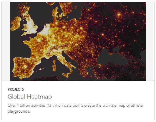
Image source: Strava
First, let’s look at some maps generated using the free Strava Global Heatmap. I’ve simply taken snips of the heatmap from the Strava website, labeled them and pasted them into this document.
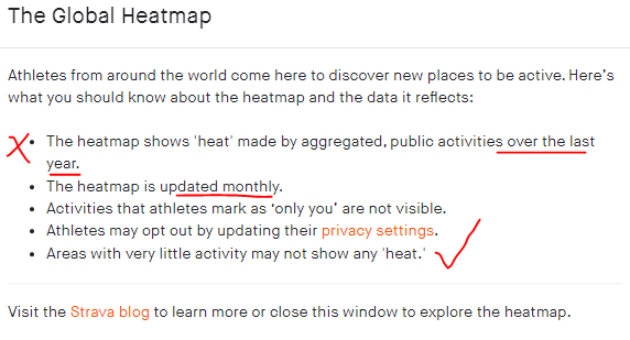
As we move through the various heatmaps keep in mind that Strava created Global Heatmap to help people who bike, run, nordic ski, etc. find popular routes, and its interface and options reflect this. It was not created for trail or land use planning purposes per se. Further, the maps are based on Strava users only.
In the heatmaps that follow, the wider, red lines indicate that the trail or path is more popular among Strava app users and blue lines less so.
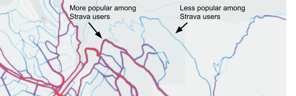
A good place to start is with a 'big picture' view of Canada and the US. Map 1 shows that most Strava users are where the most people live in North America: the eastern and western portions of the US and Canada. The northernmost large red nodes on the map are the Edmonton and Calgary areas in Alberta, Canada. The area of focus for this article is Calgary / Canmore / Banff. Strava use is mainly correlated with population concentrations and interest in and opportunity for cycling and running.
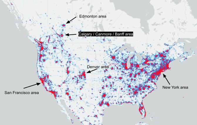
Map 1 - Canada-US Heatmap (red higher, blue lower Strava app use)
As we look at various heatmaps, here are some points of caution regarding Strava Global Heatmap. The snip below is from the Strava Global Heatmap website in July 2023.
Further:
- Strava app use as a percentage of total use varies from trail to trail and road to road (est. 1 to 20% of total use) making it impossible to infer actual user volumes from a given heatmap.
- There is no temporal aspect other than the above stated “over the last year” and what can be inferred from selecting the snow icon for certain types of winter sports.
- Map “heat” is localized (e.g., the maximum heat or brightness for a multi-use pathway in a large city vs. a small city can be the same despite many more Strava users associated with the large city’s pathway).
- In other words, heat level suggests relative popularity for a given area but cannot be compared to other areas.
- Strava activity types are based upon the sport activity selected by Strava users when they use the app. Strava Inc. lumped certain activities together for the Global Heatmap, as shown below.
|
|
Bike |
road, mountain, gravel, e-bike, etc. |
|
|
Foot |
run, trail run, hike, walk, virtual run |
|
|
Water |
canoe, kayak, paddle board, swim, etc. |
|
|
Snow |
nordic, backcountry and downhill skiing; ice skating; snowshoeing |


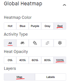
For Map 1 above, and all other Strava Global Heatmaps that follow, I have used the Global Heatmap settings above unless otherwise mentioned. Particularly, “All” was selected for activity type. Note that each activity type map has its own heat scaling (e.g., a trail on the ‘Bike’ heatmap with 1000 Strava users could have equal brightness as a trail on the ‘Foot’ heatmap with 200 Strava users). Also, note that although the foot icon includes various foot-based activities such as running, hiking and walking, many more runners use the Strava app than do hikers and walkers.
Map 2 below presents a regional view of recreational trail and road use in the Calgary-Canmore region. On the map it is very easy to identify the regional recreation hotspots, based on Strava users.
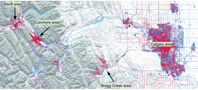
Map 2 - Calgary-Banff Region Heatmap (red higher, blue lower Strava app use)
Having lived in this region for over 50 years, and being an avid trail user myself, my general impression is that the heatmap does a good job of identifying key regional recreation 'hotspots': Calgary, Canmore, Bragg Creek, and Banff. Zooming in on central Calgary (Map 3), the popular multi-use, shared paths along the Bow and Elbow rivers, as well as certain designated bicycle routes are visible. Calgary has one of the most extensive urban pathway and bikeway networks in North America; many paths parallel water features (rivers, reservoirs and creeks).
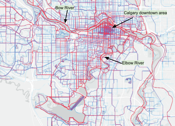
Map 3 - Heatmap: routes / paths / trails in the Calgary area (red higher, blue lower Strava app use)
The Bragg Creek area, with its extensive network of trails favored by mountain bikers also shows up well.
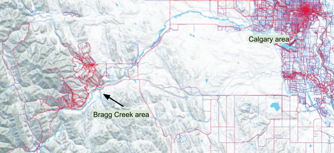
Map 4 - Heatmap: Bragg Creek area trail network (red higher, blue lower Strava app use)
Let’s now zoom in on the Canmore area (see Map 5) where I live. I know these trails very well.
The Canmore Nordic Centre’s extensive system of nordic skiing and mountain biking trails is a very obvious cluster, particularly the area near the day lodge. It makes sense that this area is associated with the most Strava app use; it is the outdoor recreation heart of Canmore.
The network of heavily-used multi-use mountain biking, running and walking trails on the periphery of Canmore are also obvious (Highline, G8, Horseshoe, and Montane trails). The very popular paved multi-use path (the Legacy Trail), used mainly by cyclists, connecting Canmore and Banff town is noticeable, too, and makes perfect sense.
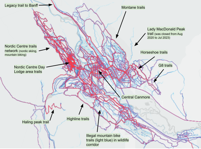
Map 5 - Heatmap: trails in the Canmore area (red higher, blue lower Strava app use)
Some of the trails leading up the local peaks (Ha Ling and Lady MacDonald) are easily identified.
Recall, these heatmaps do not show total trail use; they only show the relative popularity of trails among Strava app users.
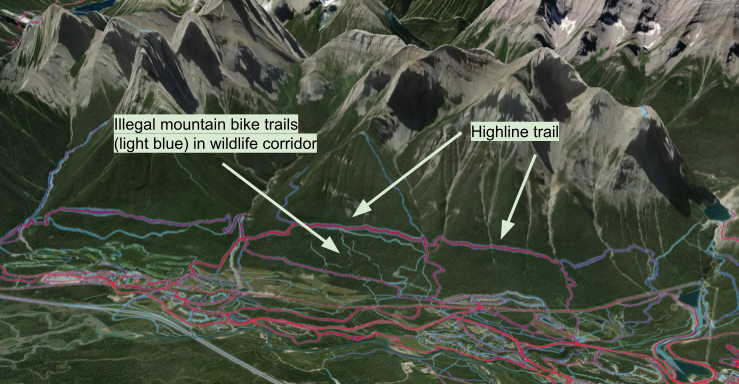
It is also possible to view the Strava Global Heatmap in 3D as shown below. Certain things become more obvious using the 3D view. For example, several pirate / illegal mountain bike trails within a designated wildlife corridor are more noticeable using 3D view. Importantly, the 3D view shows why these pirate / illegal trails are attractive to certain mountain bikers: they offer a long, steep, sustained descent from the official, designated trail above (Highline trail).
Map 6 is noteworthy: it gives the false impression that the Horseshoe trails receive more use than the popular paved urban trails and paths noted above in Map 6. Personal experience and trail counter data does not support this. The map above simply shows that the Horseshoe trails are more popular among Strava users than are the mellower paved urban trails and paths despite their high total use. This highlights a limitation of Strava GPS data.
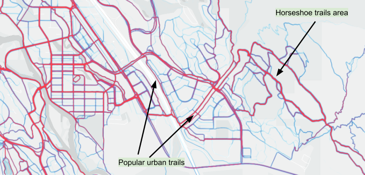
Map 6 - Heatmap: trails in the Canmore area (red higher, blue lower Strava app use)
Overall, the six heatmaps above simply show where Strava use is relatively high and where it is not. It is not possible to infer total use with a heatmap alone; another source of data, such as trail counter data, would be required.
I find Map 7 below interesting. It shows which trails and routes are used by Strava users who nordic ski, ice skate and snowshoe. However, as a longtime local resident I know that people do not nordic ski, ice skate or snowshoe on the urban roads in Canmore, as shown below. What is going on? When Strava adds a new activity type (e.g., roller skiing, e-biking, etc.), some existing users still select their historical activity type (e.g., skiing not roller skiing; biking not e-biking) because switching to the new one messes up their fitness statistics or reclassifying past activities is tedious to do. Strava makes no effort to correct this for the heatmap and indeed it would be difficult to do so.
So, it is important to understand that Strava Global Heatmaps—and indeed Strava Metro data, too— can contain oddities and anomalies and should be used carefully; local knowledge is essential.
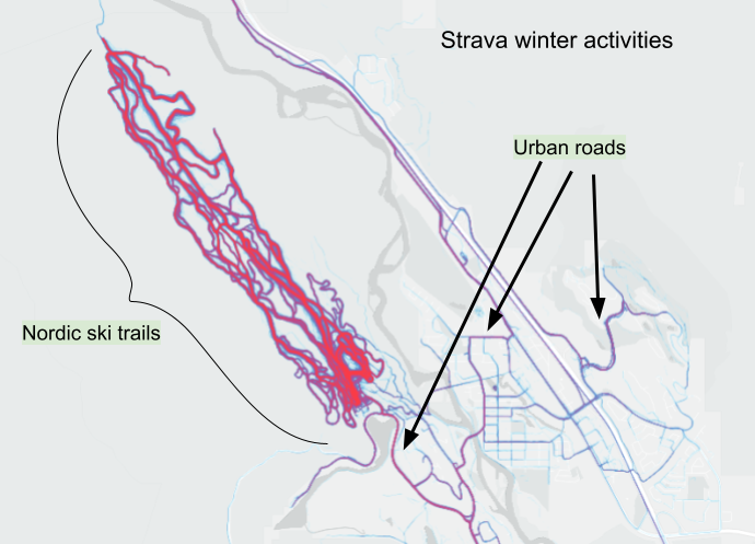
Map 7 - Heatmap: Strava winter activity types in the Canmore Area
Opportunities

Here are some of the potential opportunities Strava Global Heatmap offers in the context of trying to understand trail use better. It facilitates a 'quick and dirty' identification of:
- regional trail-based recreation networks and hotspots
- individual trails popular among Strava users (biking and running trails in particular)
- what types of Strava activities (e.g., bike, foot-based, snow, etc.) generally occur where (but not when)
- trails with potential for inter-user conflict (e.g., cyclists vs non-cyclists)
- possible locations to deploy trail traffic counters and/or to conduct surveys
- trail use in ecologically or culturally sensitive areas
- as a conversation starter among various interest groups and stakeholders
- as a screening tool for Strava Metro (i.e., are there enough Strava users to warrant Strava Metro?)
Limitations

And here are some of the Strava Global Heatmap limitations:
- Cannot infer total user volumes; for that, trail traffic counter data and/or surveys would be required.
- Cannot infer when Strava activities (e.g., cycle, run, etc.) occur at any temporal scale (hourly, weekly, monthly, etc). Strava Metro is required for that.
- Caution about Strava app user demographics (e.g., approx. 80% male; females, youth and older adults are unrepresented).
- Caution about the types of trails Strava users select and the types of activities they engage in (i.e., less likely to select mellow urban paths and more likely to select trails that present an athletic challenge).
- Comparing dissimilar trails would be folly (e.g., mellow urban path vs. hard-core mountain bike trail). Must compare like to like.
- First-hand knowledge of the general area and its trails reduces the risk of drawing inaccurate conclusions.
- Trails sometimes appear to have strange low-use sections when in reality they are simply areas where GPS reception is poor (canyons and dense forests).
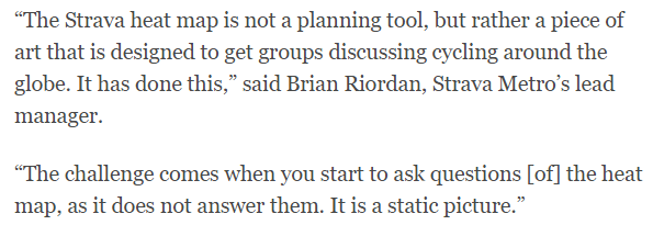
A 2015 quote from Brian Riordan, of Strava about Strava Global Heatmap are good words of warning.
Strava Metro
Whereas Strava Global Heatmap is only suitable for very cursory, high-level purposes, Strava Metro’s rich data allows for more detailed analysis and insights including specific activity types (mountain bike, run, walk, hike, nordic ski, snowshoe, etc.), direction of travel, gender, age, trail network patterns, speed, duration, routes, etc.
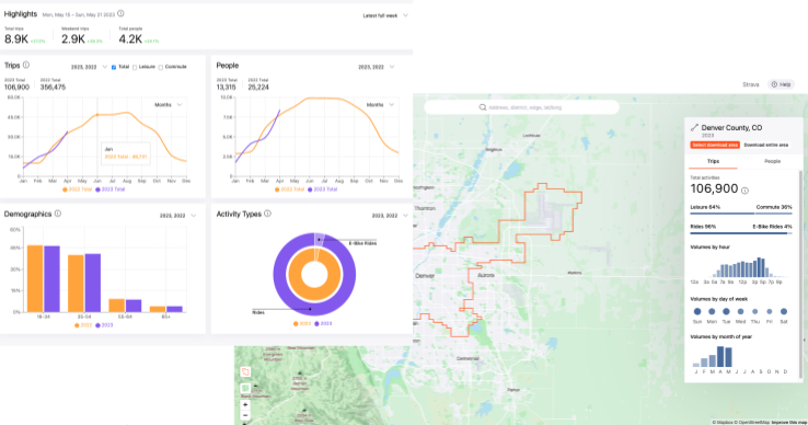
Image source: Strava
Strava Metro is a free service for qualified organizations. It provides the aggregated, anonymized GPS data and other information associated with Strava users for a particular location, generally for a 24-month period.
Strava Metro was a paid service from 2014 to 2020 but in late 2020 Strava graciously made it free. Why would Strava do this? The below is from a 2021 Strava blog post.
It is worth highlighting that Strava mentions “both urban and rural”. Whereas Strava Metro data has historically been used in the urban domain, there is potential to use it in rural areas, too, though there are few such published examples. One note of caution about rural areas: Strava data sets might be significantly smaller than those from typical urban areas simply because there are fewer people, particularly fewer Strava users, and hence the risk of errors and inaccuracies related to small sample size are higher.
Assuming it is used properly, Strava Metro data is suitable for public planning purposes, and in early 2020 Strava stated that over 300 communities have used it.
Strava Metro data is generally a good match for larger networks of higher use:
- Bicycle-oriented routes, paths, trails, etc.
- Multi-use paths and trails used by people who ride and run
- Mountain bike trails
Opportunities
Once Strava data has been validated (see next section), some of the potential opportunities Strava Metro offers includes:
- Using Strava users as rough proxy for overall users to
- better understand the spatial distribution, flow and route selection of users (i.e., where do people ride, run, etc.)
- to better understand certain temporal aspects (e.g., busiest months).
- To gain insights about route origin and destination, and travel times.
- To determine direction and speed of travel.
- To determine how many hours (i.e., duration) some trail users use trails daily, weekly, monthly, etc.
- To gain insights into use type (e.g., bike vs. non-bike).
- Keep in mind the app is primarily used by male cyclists and runners so a survey would be necessary to capture the full range of use types (e.g., walkers, skateboards, roller bladers, etc.) and demographics (gender, age, etc.).
Limitations
What are some Strava Metro data limitations and cautions? Some of these include:
- Strava Metro data is more reliable when applied over larger regions and over longer periods of time (i.e., months rather than hours and days), and when examining relative changes. It is less reliable when used, for example, on a single or small number of trails or routes over shorter time periods (e.g., a few days).
- Strava Metro data has important limitations including: (1) walkers and hikers are underrepresented (small sample size weakness); (2) demographic bias (women, youth and older people are unrepresented); (3) a good understanding of data science is required; (4) improper use of simple statistical correlations can lead to misleading conclusions; (5) rounding error inaccuracies for lower use trails and hours; (6) inappropriate for very low use trails (Strava’s algorithm generally disregards these); and, (7) it needs to be calibrated with conventional “small data” techniques such as counters and surveys.
- Strava Metro data has rounding issues that affect lower use trails and hours. In 2021, Strava changed how it handles low counts. Hourly counts of 3 or less are rounded down to 0; all other counts are rounded to the nearest multiple of 5. This small change has the potential to dramatically affect (1) lower use trails, and (2) lower use hours of higher use trails. All trails except those that receive consistently high levels of use are affected by this rounding issue. Less-used urban, rural or remote trails and routes are most affected.
This section on Strava Metro barely scratches the surface. For further information, see Appendix 1 for several key readings regarding Strava Metro. Also, see Strava Metro’s Getting Started guide.
Strava Metro and trail counter data
Because the percentage of Strava users varies from trail to trail and route to route (est. 1 to 20%), trail counters and/or surveys are necessary for validation and 'truthing' purposes, as was done by Griffin and Jiao (2014) in Austin, Texas and in many other studies since. That is, you need to mathematically establish that Strava user volumes correlate well with actual trail user volumes on a variety of trails. If not, faulty and inaccurate conclusions and decisions can arise.
To gain the confidence of the public and decision makers, it is necessary to deploy counters and/or conduct surveys at a sufficient number of locations, for a sufficient duration of time to 'truth' the Strava counts.
A counting program involving Strava Metro data might have these main aspects:
- a number of permanent counters at key higher use locations to anchor everything, and
- a number of temporary counters for short duration counts that are moved around from location to location so that data is gathered from a sufficient number and types of trails. Generally, at least a week of data (7 days) that includes weekends is recommended for short-duration counts. On trails with lower traffic volumes, longer installation periods are required.
Data from the counting program can then be used with Strava data to determine:
- Strava users as a percentage of total users on selected trails.
- As mentioned several times in this article, this often varies between 1 and 20%, depending on the trail.
- One experienced research team (2022) recommended 7% or greater of total users to reduce representativeness (e.g., male bias) and other issues associated with Strava data.
- Statistical correlations (i.e., how well do Strava user volumes represent actual trail user volumes?)
- Strava Metro provides the five main steps for determining correlations; note this 2023 study and others found that correlations determined over longer time periods (e.g., a month) are more accurate than shorter time periods (e.g., a few days).
- The month-to-month, season to season, and year-to-year variations in the number of Strava users on selected trails.
- Oregon data showed that Strava users as a percentage of total trail use varied monthly on the same route.
- Another study showed there were significant seasonal and annual changes in the number of Strava app users.
As mentioned earlier, Strava Global Heatmap can potentially be used to assist in locating counters, though Strava Metro is even better for this.

Once Strava data has been validated and truthed on a sufficient number and variety of trails for a sufficient time period, it is then possible to attempt inferences about the larger trail network, keeping in mind the Strava data limitations and biases mentioned earlier. This potentially reduces the number of trail counters required, and their associated cost (e.g., purchase price, staff time, etc.). The savings could potentially mitigate or offset the indirect costs associated with Strava Metro data (e.g., the time to query, analyze and integrate Stava data, pay a data scientist, etc.).
An advantage of using Strava Metro data is that simple, lower cost volumetric trail traffic counters can potentially be used rather than higher cost ($1000 to $3000) specialty counters that classify (bike vs non-bike) and/or provide direction of travel data. That is, Strava Metro data provides a basis to estimate, for example, bike vs non-bike use, direction of travel, speed, etc., allowing simpler, lower cost volumetric counters to be considered.
In short, Strava Metro creates the potential to reduce overall program costs while providing richer and more complete data (use type, direction of travel, route selection, origin - destination, etc.), over a wider area.
It is also possible to use Strava data retroactively. That is, if there are existing counters and counter data, it is generally possible to use this with historic Strava data.
Conclusions
The data world is rapidly changing. Today, there are types of trail data that were unavailable in past years. Strava data, a type of crowdsourced, ‘big data’, is an excellent example. It is unlikely that any one source of trail data will replace all others. Instead, the different sources (crowdsourced GPS-based, trail counter, surveys, etc.) have the potential to complement and strengthen each other.
Because Strava data is based upon GPS tracks, it is particularly good at showing where Strava users go, and providing other rich information, and has potential to be used as a powerful lens for better understanding trail use in a particular area, provided its limitations are kept firmly in mind. In this article I suggested that Strava Heatmap works best at the very coarse level, and Strava Metro at the finer, more detailed level. Both work better when trail counter data and/or survey is available.
Whereas most published use of Strava Metro data to date has been in urban areas in the context of bicycle-related transportation planning, Strava Metro data has potential to be used in the context of trail networks, particularly larger ones used by people who run or ride (e.g., multi-use trail networks in urban and non-urban areas).
Strava app use, as a portion of total trail use, varies from trail to trail (est. 1 to 20%). For accuracy, and to gain the confidence of the public and decision makers, it is necessary to determine the percentage of Strava users on a suitable selection of trails. This can be done using lower cost volume-only trail traffic counters in conjunction with the Strava data, or by conducting surveys. The combination of Strava data, volumetric counter data and/or surveys opens the door to cost-effective user classification (bike, gender, etc.) and other insights over a large area.
There is potential, with Strava data, to reduce overall project costs while at the same time providing richer and more complete information for planning, management, and advocacy purposes over a much wider area. In Appendix 1 I list some key references for those wanting to learn more.
Appendix 1 - Suggested reading
A search of Google Scholar with the key word “Strava Metro” currently (2023) yields 481 results. Below are three references that I found particularly helpful and insightful, and flag some of the key issues associated with Strava data. Again, this is simply a start point. For more references regarding Strava data, use Google Scholar or other similar services.
Crowdsourcing Bicycle Volumes (2014)
Whereas a number of cities have used Strava Metro data, in my opinion, the case of Austin, Texas is a good example to showcase because of its rigour and detailed analyses.
Full title, authors, and date
Crowdsourcing Bicycle Volumes: Exploring the role of volunteered geographic information and established monitoring methods; Griffin and Jiao; 2014.
Abstract
The recent interest in performance measures and new bicycle infrastructure development has triggered rapid advancements in monitoring methods for active transportation, but comprehensive monitoring programs for the bicycle mode are far from ubiquitous. This study evaluates the use of GPS survey data and a new crowdsourced volume dataset that may offer promise to extend the reach of limited counting programs. The authors integrated count data from five separate trail locations in Austin, Texas, with a previous survey using the CycleTracks smartphone application and a new data product derived from a larger-scale use of the Strava fitness application. New crowdsourced methods offer a prospect of expanding the relative time and geography of bicycle traffic monitoring, but do not currently offer many other attributes about trips obtainable from other methods. Further studies involving the combination of high-accuracy monitoring points with crowdsourced datasets may improve the efficiency of monitoring programs over large areas.
Some salient points
Some of the salient points, particularly about the use of counters and validation, are below.
- The study evaluated two smartphone apps with cycle-planning potential: Strava and CycleTracks
- One-week of bicycle traffic counter data and app data were compared for five locations in Austin.
- The results are below (p. 12)
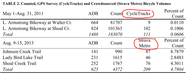
- The results showed that CycleTracks users, as a percentage of total bicycle counts, were very low (<0.5%) and that Strava Metro users were a higher percentage (2.8% to 8.8%).
- The study stated that although Strava app use varies from trail to trail, it is also likely to vary in proportion to actual volumes for a given trail.
- They concluded, among other things, that crowdsourced ‘big data’ shows promise for estimating volumes of bicyclists, though it is bounded by certain limitations.
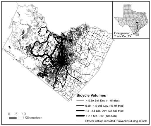
- The authors cautioned that crowdsourced datasets, such a Strava Metro, may or may not represent the given population that is the focus of a transportation planning initiative.
- They recommend the number of locations be increased, and counts of at least one-week duration be performed, as per guidance by Figliozzi, Johnson, Monsere, & Nordback 2014; Nordback & Janson 2010; Turner & Lasley 2013; United States Department of Transportation Federal Highway Administration 2013
- In a later paper the authors suggested that a longer duration (i.e., more than one week) may provide stronger predictive power in areas with relatively low volumes (Griffin and Jiao, 2015).
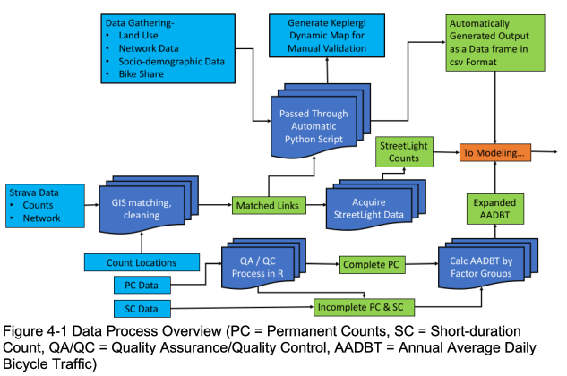
Exploring Data Fusion Techniques to Estimate Network-Wide Bicycle Volumes (2022)
This paper is a research tour de force by a team of PhDs. It includes very valuable and insightful information about crowd-sourced GPS data such as Strava as well as about conventional data sources (counters, surveys, etc.) and AI / machine learning options. If I had to select a single authoritative reference about big data (e.g., Strava), small data (e.g., trail counter data) and AI, this would be it. Importantly, the authors include a very comprehensive summary of available literature and some excellent summary tables regarding Strava data. Surprisingly, despite visiting the lofty realms of big data and AI one of the paper’s key findings is that rather than replacing conventional data sources (counts, surveys, etc.), “...big data sources like Strava and StreetLight actually make the old “small” data even more important.” This echoes the quote on page 3 of my article: “Big data makes very little sense without small data to benchmark against”.
Full title, authors, and date
Exploring Data Fusion Techniques to Estimate Network-Wide Bicycle Volumes; Kothuri, Broach, McNeil, Hyun, Mattingly, Miah, Nordback and Proulx; 2022
Abstract
This research developed a method for evaluating and integrating emerging sources (Strava, StreetLight, and Bikeshare) of bicycle activity data with conventional demand data (permanent counts, short-duration counts) using traditional (Poisson) and advanced machine learning techniques. First, a literature review was conducted, along with cataloging and evaluating available third-party data sources and existing applications. Next, six sites (Boulder, Charlotte, Dallas, Portland, Bend, and Eugene) that represented a variety of contexts (urban, suburban) and geographical diversity were selected. Of these, Boulder, Charlotte and Dallas constituted the basic sites, where one year of data (i.e., 2019) was used for modeling. Portland, Bend, and Eugene in Oregon were considered enhanced sites, where three years of data (2017-2019) were used for model estimation. Demographic, network, count and emerging data were gathered for these sites. Using these data, Poisson and Random Forest models were estimated. The model estimation process was designed to allow for comparison of the relative accuracy and value added by different data sources and modeling techniques. Three sets of models were specified – All City Pooled, Oregon Pooled and city-specific models. In general, the three data sources (static, Strava, and StreetLight) appeared to be complementary to one another; that is, adding any two data sources together tended to outperform each data source on its own. Low-volume sites proved challenging, with the best-performing models still demonstrating considerable prediction error. City-specific models generally displayed better model fit and prediction performance. Using Strava or StreetLight counts to predict annual average daily bicycle traffic (AADBT) without static adjustment variables increased expected prediction error by a factor of about 1.4 (i.e., a 40% increase in %RMSE). That rule of thumb figure of 1.4 times was only slightly lower when combining Strava plus StreetLight without static variables (1.3x). Tests of transferability showed that transferring the model specifications without reestimating the model parameters resulted in 10-50% increase in error rate across models. Performance of machine learning models was comparable to count models. The findings from this study indicate that rather than replacing conventional bike data sources and count programs, big data sources like Strava and StreetLight actually make the old “small” data even more important.
Some salient points
- Strava (and Streetlight) data provide valuable bicycle volume information at specific locations but they still require traditional “small” data (e.g., counters, surveys, etc.), too; the best performing models used a combination of data sources.
- AI / machine learning models did not make better predictions than non-AI / machine learning models.
- Don’t apply a model developed from data in one city to another, or a model developed using one year’s data to another (without re-estimating parameters).
- Predicting volumes at lower-volume locations is difficult and error prone.
- More permanent continuous count stations are needed, particularly at lower-volume locations.
- Strava vs counter correlations vary by bicycling volume, and can be r=0.55 or less on lower count locations (Section 3.5.2), and an overall high correlation (e.g., r=0.79) may mask this issue.
- Table 3-1 is an excellent summary of existing non-motorized data validation / cleaning approaches; the details of their own approach is found in Section 4.2.1
- Table 3-2, a summary of peer-reviewed journal articles, shows that Strava users are overwhelmingly male, ranging from 75 to 83%, depending on the study.
- Table 3-3 shows that Strava users range from 1 to 20% of total users.
- Few counting initiatives use short-duration counts (e.g., one or several weeks) despite their usefulness. Section 3.4.1 lists some such studies. Average annual daily estimations are minimized by using day-of-year and monthly factors.
- Strava users are typically male (75 to 83%), age 35-44, and do more recreational trips than the general cyclist population (Section 3.5.1), whereas US national estimates indicate 51 to 60% male for all cyclists.
- App users ride more often than non-app riders.
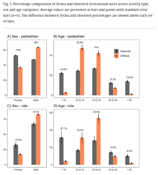
Bias and precision of crowdsourced recreational activity data from Strava (2023)
I feel this is an important paper because it highlights some Strava data weaknesses that might otherwise be overlooked, and it also considers Strava data in the context of general recreation, not just cycling.
Full title, authors, and date
Bias and precision of crowdsourced recreational activity data from Strava; Venter, Gundersen, Scott and Barton; 2023
Abstract
Recreational activity is the single most valuable ecosystem service in many developed countries with a range of benefits for public health. Crowdsourced recreational activity data is increasingly being adopted in management and monitoring of urban landscapes, however inherent biases in the data make it difficult to generalize patterns to the total population. We used in-situ observations and questionnaires to quantify accuracy in Strava data - a widely used outdoor activity monitoring app – in Oslo, Norway. The precision with which Strava data captured the spatial (R2 = 0.9) and temporal variation (R2 = 0.51) in observed recreational activity (cyclist and pedestrian) was relatively high for monthly time series during summer, although precision degraded at weekly and daily resolutions and during winter. Despite the precision, Strava exhibits significant biases relative to the total recreationist population. Strava activities represented 2.5 % of total recreationist activity in 2016, a proportion that increased steadily to 5.7 % in 2020 due to a growing usership. Strava users are biased toward cyclists (8 % higher than observed), males (15.7 % higher) and middle-aged people (20.4 % higher for ages 35–54). Strava pedestrians that were able to complete a questionnaire survey (>19 years) were biased to higher income brackets and education levels. Future studies using Strava data need to consider these biases – particularly the under-representation of vulnerable age (children/elderly) and socio-economic (poor/uneducated) groups. The implementation of Strava data in urban planning processes will depend on accuracy requirements of the application purpose and the extent to which biases can be corrected for.
Some salient points
- Strava data overrepresented cyclists, males and middle-aged people (35-54) and underrepresented youth, elderly, and low socioeconomic status groups.
- Youth (<19 years) were 4% of Strava app users but 27% of recreationalists.
- Strava data captures spatial variations in recreational activity more accurately than temporal variations.
- Trend analyses need to account for growth in Strava usership and time of year.
- Strava data suitability in urban planning depends on accuracy and bias tolerances.
- Strava data, like other crowdsourced data, is a small subsample of the total population and needs to be calibrated with fixed-point counters so that one can make population-level estimates of total activity volume.
- Drawing conclusions regarding winter activity was less accurate than summer activity.
- Strava data may be better suited for ecological purposes because the demographic biases are less important in this context.
- However, the authors note that Strava data is not suitable for off-trail use because Strava “snaps” such GPS locations to the nearest trails.
- The most robust use-case for Strava data is comparing recreation use intensity between different areas over different times, for example, in the context of route preferences and selection.
Vehicle Counter / Infrared Trail Counter / OHV Counter / Mountain Bike Counter